Our family room, alongside the kitchen, is hands down the most lived in room in our house. We tend to begin and end our day in this room. In fact, when I asked Wyatt 20 questions for a keepsake exercise (when he turned 3 at the end of June) he answered the question, “What is you favorite thing to do at home?” with “Going to the pond and to play in the family room with mommy and daddy!” (Talk about melting your freakin’ heart…?!)
![How To: Picture Ledge Gallery Wall [+ A Giveaway!]](http://thelovelylauralife.com/wp-content/uploads/2016/08/IMG_7664.jpg)
![How To: Picture Ledge Gallery Wall [+ A Giveaway!]](http://thelovelylauralife.com/wp-content/uploads/2016/08/IMG_7665.jpg)
This room has always felt like one of the most finished rooms in our house. We’ll begin replacing the carpet flooring in this room with the same flooring we put in the kitchen and in the mudroom at the end of the summer (because it’s pretty gross) but beyond that it has always been just mere finishing touches in this room. This is the fun part, right? The relatively inexpensive part. The part that’s not supposed to be intimidating…
Then why the heck has it been so intimidating?! Blah! Haha! Seriously. Aside from a poster I’ve hung in Wyatt’s room, the modern wall art in Thurser’s room, a coffee bar shelf in the kitchen and random things on nails that were in the walls from previous owners — we haven’t put anything else on the walls in the 2 1/2 years we’ve lived here.
![How To: Picture Ledge Gallery Wall [+ A Giveaway!]](http://thelovelylauralife.com/wp-content/uploads/2016/08/IMG_7668.jpg)
![How To: Picture Ledge Gallery Wall [+ A Giveaway!]](http://thelovelylauralife.com/wp-content/uploads/2016/08/IMG_7672.jpg)
Perhaps I’m making more of this than it really is, I mean it’s hard to prioritize printing and hanging photos or art around your house when you kitchen floor is literally crumbling beneath your feet. But it’s also a little bit of what makes a house feel like a home (aside from the people that live in it), right?
A few weeks ago I finally bit the bullet. Minted had reached out to me and offered to work with me and provide some artwork that I really wanted for our home — the timing couldn’t have been better. You see I had finally come to the conclusion that this perfect scenario/vision/etc. I had for how artwork would come together in our home just wasn’t going to happen.
Perfectionism was stunting my ability to just make it happen. To take a few risks, try something, see if it worked. And then chalk the whole thing up to an experiment, as opposed to a win or fail.
I was ready to just make it happen.
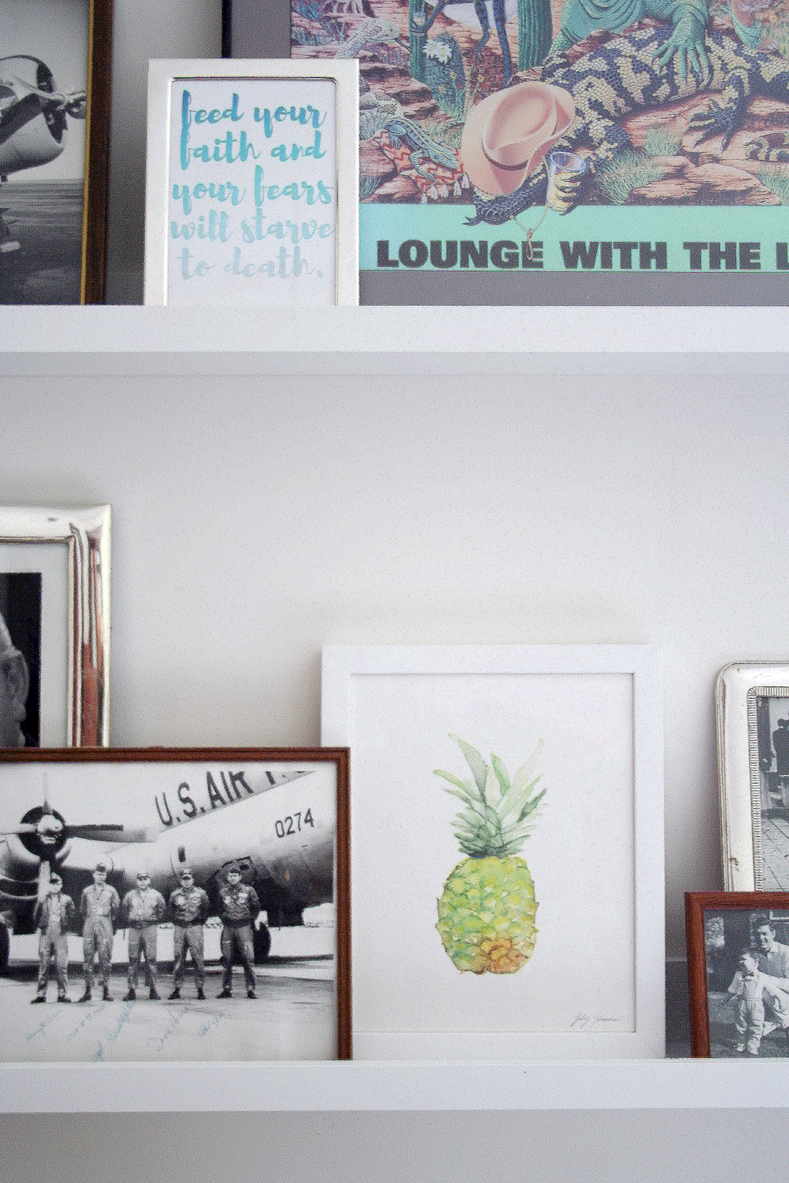
Originally I thought two larger pieces flanking the couch and window would be best, but ultimately I decided on utilizing picture ledges for a more modern gallery wall feel. I already had a stack of old framed photos of my Grandma’s just collecting dust in our office (that and about a million other things in there) and I knew I definitely wanted to incorporate these in whatever I did.
![How To: Picture Ledge Gallery Wall [+ A Giveaway!]](http://thelovelylauralife.com/wp-content/uploads/2016/08/IMG_7669.jpg)
![How To: Picture Ledge Gallery Wall [+ A Giveaway!]](http://thelovelylauralife.com/wp-content/uploads/2016/08/IMG_7674.jpg)
When it comes to style, I love balance: masculine and feminine. Modern and rustic. Heirloom and new. Honestly? Aside from something just being well designed in the first place I believe balance is the only characteristic that is a necessary component of timeless style.
Despite my years deliberating hanging art, etc. on the walls of our home, the ‘picture ledge gallery wall’ (as I’m calling it) in our family room actually came together rather quickly — after I made the ironically simple decision to just do it.
So, I thought I’d share with you today a few things I kept in mind and that helped me create a visually pleasing gallery wall; that involved minimal time, virtually no planning and absolutely no perfecting. :)
![How To: Picture Ledge Gallery Wall [+ A Giveaway!]](http://thelovelylauralife.com/wp-content/uploads/2016/08/IMG_7675.jpg)
![How To: Picture Ledge Gallery Wall [+ A Giveaway!]](http://thelovelylauralife.com/wp-content/uploads/2016/08/IMG_7676.jpg)
HOW TO: PICTURE LEDGE GALLERY WALL
1 | Vary the sizing. This one probably seems obvious, so don’t scoff at me for including it, but it’s also a pretty important one. I found that varying the size of the print as well as the placement of different sized prints helped achieve that effortless aesthetic I love. Personally I think the wider range of sizes included the better. And as far as placement goes, it’s best to arrange the prints so that their heights go up and down and up again, as opposed to stair-stepping them one way across the width of the arrangement.
2 | Balance color with neutrals. I’ve definitely always planned on including brighter pops of color in the art in our home. I largely enjoy neutrals across the board, they are calming and comfortable to me, but color always adds interest and personality. That said, color (to me) always carries more visual weight with it. So balancing it with seemingly disproportionate amounts of neutral tones in fact balances it. Make sense? You’ll notice I included a lot of black and white photography in my mix, much more of it than colored illustrations. That’s partly because these pieces were ones I already owned and are very sentimental to me, but also (in regards to design) they help immensely to balance the weight of the larger pops of color and other statement pieces. The end result being an aesthetic that is not overstimulating yet still intriguing to the eye.
3 | Include small doses of juxtaposition. Sometimes even well designed and balanced arrangements just don’t feel finished, ya know? This is when I almost always implore the use of juxtaposition. It’s the same premise as balancing with opposites, in a much more dramatic way. I’ve always loved using typography in this way. I think it reads as a much more abstract form of art. These were the last pieces I added, and they sealed the deal for me.
![How To: Picture Ledge Gallery Wall [+ A Giveaway!]](http://thelovelylauralife.com/wp-content/uploads/2016/08/IMG_7677.jpg)
OH YEAH, THE GIVEAWAY!
I decided to host my first ever giveaway today! And I’m kind of super pumped about it! Haha! Mainly because someone has some free art (or other Minted goodies) coming their way! But also because it’s a super straight forward giveaway, meaning all you have to do is fill out your name and your email address. And that’s it. Okay, now before I start blabbering — the details:
In partnership with Minted, today we are giving away $150 of Minted credit (eek!) to one person. The giveaway is only open to legal residents of the 50 United States and District of Columbia who are at least 18 years old. The giveaway is set to run from when (this post goes live on) 8/5 until 11:59 pm PDT on 8/12. Once it ends, a winner will be randomly drawn, contacted and sent out their $150 prize.
Interested?
(UPDATE 8/13/16: Giveaway now closed)
You guys seriously rock. I’ve been feeling really blessed by this community lately, and I don’t know I guess I just want to say thank you? I mean really I feel like giving you a hug or an awkward fist bump, but that might weird you out. So I’m hoping if I just say thank you enough it might actually mean something. So again, thank you.
. . .
If you liked today’s post, you can shop it and support The Lovely Laura Life at the same time by using these affiliate links:
01 / Watercolor Piña Art Print
02 / Vivid Horizon Art Print
03 / Apertures No. 2 Art Print
04 / Missouri Art Print
All other prints are family photos, previously owned or designed by me. I will be sharing the “Nothing worth having comes easy” typographic print in a couple of weeks as a free printable!